
When we needed to pick out colors for our downstairs, we were already needing to go to Lowe's for something else. All of our paint choices ended up being Lowe's colors, or colors available in the Valspar Signature premium paint. We were a little hesitant to spend an extra $5-$10 per gallon, but so far, the paint has been working beautifully. In some cases, we were able to get by with using only one coat, which will save us money in the long run. We kind of prefer the Valspar to the Glidden now, although the Glidden did seem to spread better and go farther.
Picking colors for downstairs was probably easier than upstairs. With shared walls and an desire for more neutral colors, we picked "Linen" for our kitchen/dining room walls.

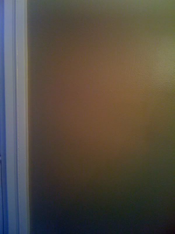
Top color is Linen by Eddie Bauer and the bottom color is String of Pearls, a Lowe's Creative Ideas for Colors shade.
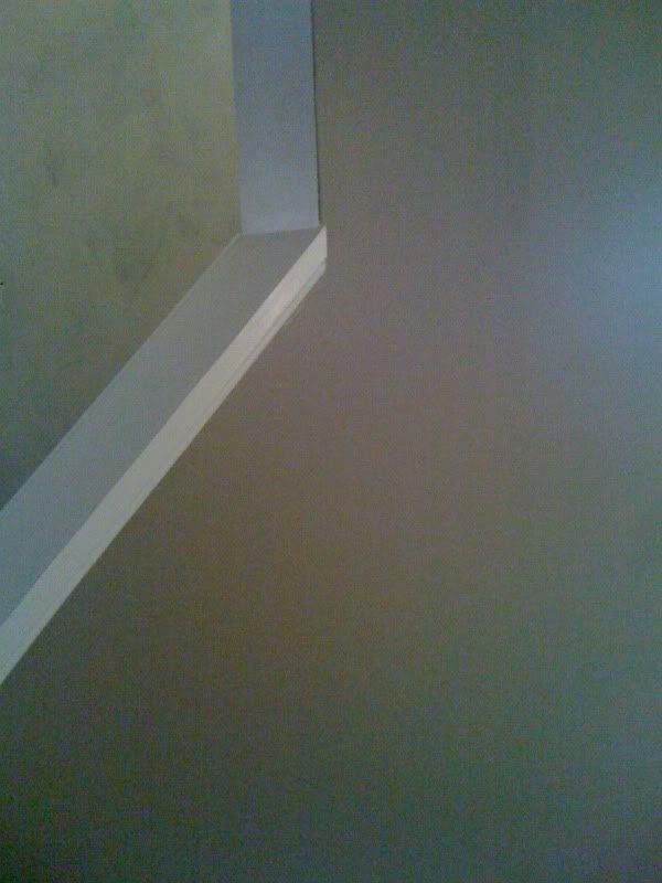
String of Pearls is the color we are painting all of the trim in the downstairs. This color will also be carried up the stairway through the baseboard trim and the hand rail.
For the living room, we picked Colonial Beige.

This is a Waverly signature color. Again, String of Pearls trim color on the bottom.
It's a little darker than Linen, which is perfect because we wanted a noticeable, but not overwhelming contrast between the two colors. The colors have to coordinate well because the living and dining rooms share a wall. We decided to use Linen on that wall so it would be an accent color in the living room.
For the addition entranceway and the walls in the stairway, we wanted a neutral and coordinating color. Waverly's Natural seemed to be a perfect fit.

It's weird how the colors look so identical/monotone online, but the paint chips and actual paint colors look so much different!
For the bedroom in the addition, which will most likely serve more as a living room, we picked a greyish-blue from Lowe's Creative Ideas for Color line. It's called Hot Springs and it is fabulous!

It's looking a little green on my computer screen, however.
So, with our colors picked and some of them even up on the walls already, We have to start thinking about our decor plans for these rooms. I am so excited over how much like a home this place is shaping up to be!
I always only seem to have my iPhone on me when it's picture time, so I apologize for these. Here are a few shots I took of the Colonial Beige on our living room walls. It looks different in every one, thanks to poor camera quality and weird lighting. The color actually looks more greenish as the daylight goes away. I really like the color next to the String of Pearls trim!
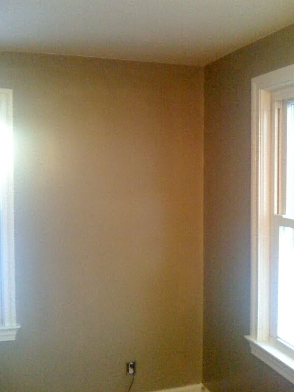
It looks 8,721,624 times better in person. Trust me. :-)
And it looks 9,563,521 times better than the orange and dark grey-blue that were on the walls when we bought the place. (How could it not?!?) Yay for progress!
No comments:
Post a Comment
Got something to say about this?