Showing posts with label Paint. Show all posts

January 11, 2010

Adding some color

We were at Home Depot when we decided it's time to buy paint for our upstairs.  We gathered some paint chips and picked our colors, which all happened to be Glidden paint.  We were really happy with how our walls turned out.

When we needed to pick out colors for our downstairs, we were already needing to go to Lowe's for something else. All of our paint choices ended up being Lowe's colors, or colors available in the Valspar Signature premium paint.  We were a little hesitant to spend an extra $5-$10 per gallon, but so far, the paint has been working beautifully.  In some cases, we were able to get by with using only one coat, which will save us money in the long run.  We kind of prefer the Valspar to the Glidden now, although the Glidden did seem to spread better and go farther.

Picking colors for downstairs was probably easier than upstairs.  With shared walls and an desire for more neutral colors, we picked "Linen" for our kitchen/dining room walls.


Top color is Linen by Eddie Bauer and the bottom color is String of Pearls, a Lowe's Creative Ideas for Colors shade.

String of Pearls is the color we are painting all of the trim in the downstairs.  This color will also be carried up the stairway through the baseboard trim and the hand rail.

For the living room, we picked Colonial Beige.


This is a Waverly signature color. Again, String of Pearls trim color on the bottom.


It's a little darker than Linen, which is perfect because we wanted a noticeable, but not overwhelming contrast between the two colors.  The colors have to coordinate well because the living and dining rooms share a wall.  We decided to use Linen on that wall so it would be an accent color in the living room.

For the addition entranceway and the walls in the stairway, we wanted a neutral and coordinating color.  Waverly's Natural seemed to be a perfect fit.


It's weird how the colors look so identical/monotone online, but the paint chips and actual paint colors look so much different!

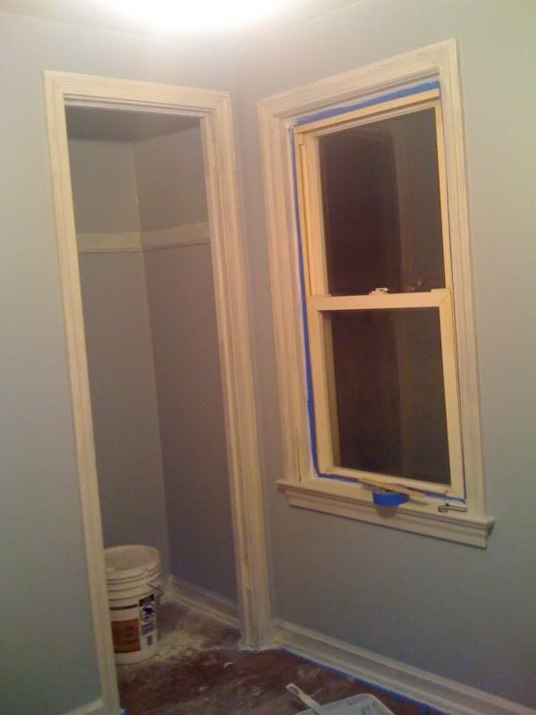
For the bedroom in the addition, which will most likely serve more as a living room, we picked a greyish-blue from Lowe's Creative Ideas for Color line.  It's called Hot Springs and it is fabulous!


It's looking a little green on my computer screen, however.

So, with our colors picked and some of them even up on the walls already, We have to start thinking about our decor plans for these rooms.  I am so excited over how much like a home this place is shaping up to be!

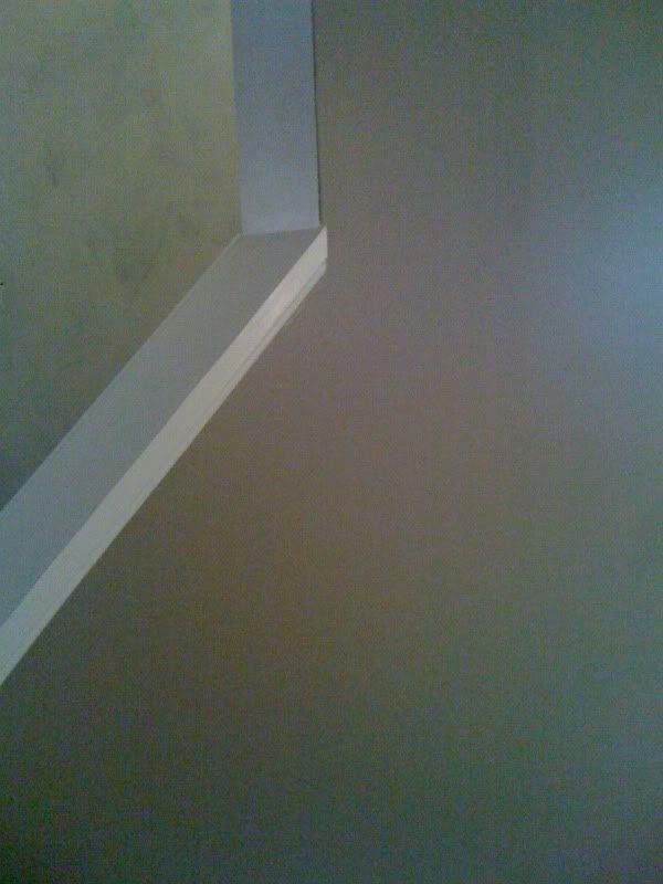
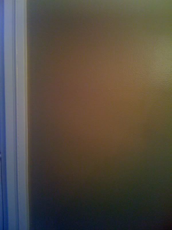
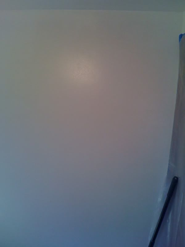
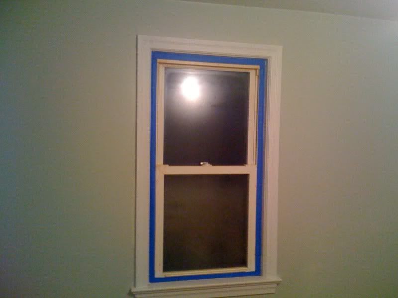
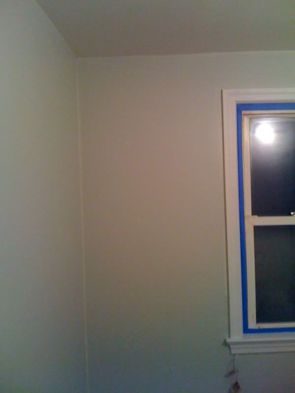
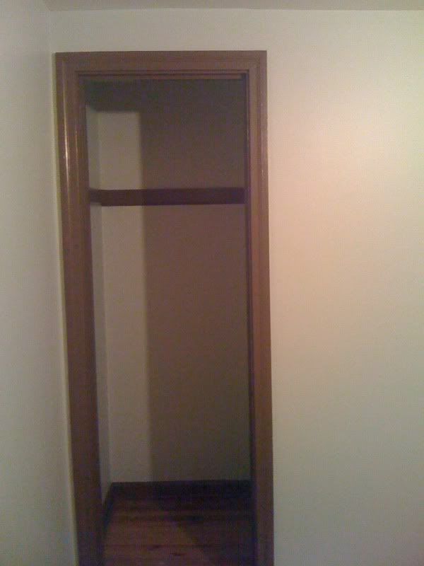
I always only seem to have my iPhone on me when it's picture time, so I apologize for these.  Here are a few shots I took of the Colonial Beige on our living room walls.  It looks different in every one, thanks to poor camera quality and weird lighting.  The color actually looks more greenish as the daylight goes away.  I really like the color next to the String of Pearls trim!  
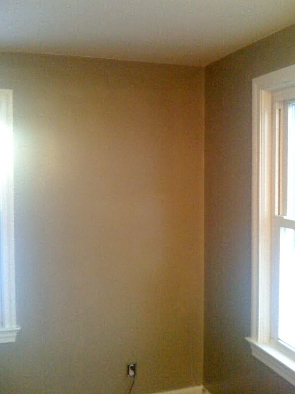


It looks 8,721,624 times better in person.  Trust me.  :-)

And it looks 9,563,521 times better than the orange and dark grey-blue that were on the walls when we bought the place.  (How could it not?!?)  Yay for progress!

December 4, 2009

What was once scary yellow is now a peaceful shade of green

Next on our to do list was the scary, school bus yellow bedroom.  While the cigarette damage wasn't as bad in this room, covering the bright colored wall presented a challenge.  We knew our problem was no match for Kilz and primed that obnoxious room with their Premium product, a primer designed to both block stains and hide colors.  It's also good for mildew-prone areas, but we were more interested in its ability to cover up the hideous paint colors left for us by the previous owner.


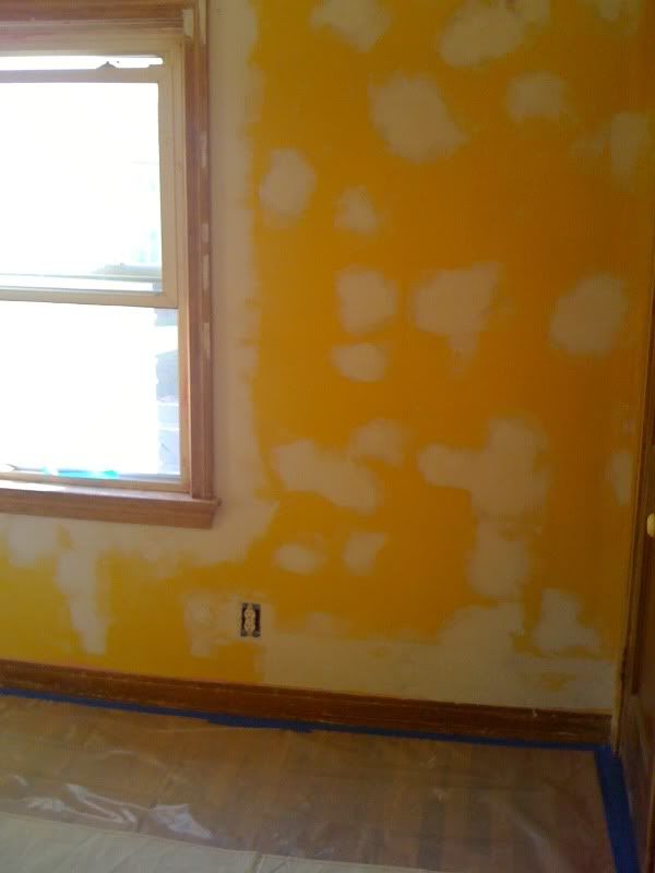
So, here we go.  Scary yellow wall before primer:


(Yes, there were that many holes and imperfections in this wall.  We had to do a lot of patching)


Scary yellow wall during the priming:


And no more scary yellow wall!


Now, with a blank slate, we began brainstorming on a color for the wall.  Since this room will be our guest bedroom, we wanted to make it a peaceful and serene color that was anything be the yellow it once was.  After looking at what seemed like hundreds of paint chips, we decided on Glidden's Soft Meadow:


And, I think it looks wonderful!


And with the trim painted in Behr's Traditional:


The room looks about a million times better and I can't wait to start putting stuff in here.  We probably aren't going to refinish the hardwood floor in this room because, between furniture and area rugs, most of it isn't going to show.  And, outside of a few pink paint splotches, the floor is in decent shape.

It is so nice to be done painting in at least one of the rooms!  Yay for progress!


December 3, 2009

Painting our house (or making the bad stuff disappear)

Yes, I know posting has been very light lately.  I guess you could say our renovations have been a little less talk and a lot more action for the month of November.  We have been very busy painting. VERY busy painting.

We started in the smallest bedroom.  As of now, we plan on using this room for an office, but it will probably be converted to a nursery whenever we get around to having children.  This room also had the most noticeable cigarette smoke damage of all the rooms.  The walls and ceiling were a slight off-white when we scrubbed them down, but the smoke made them more of a light brown.  It was pretty gross!

We wanted to be sure the discoloration was completely covered by primer before we painted.  And with the amount of smoke damage, we pulled out the big guns to get the job done.


We purchased Kilz Complete because it promised to provide excellent adhesion, hide imperfections and block smoke and nicotine stains on walls.  Just what we needed!  It's an oil-based primer, so it was really thick, smelled really bad and was a pain in the butt to clean up. But, it was worth it!  It did exactly what we wanted it to do.  This stuff really works!


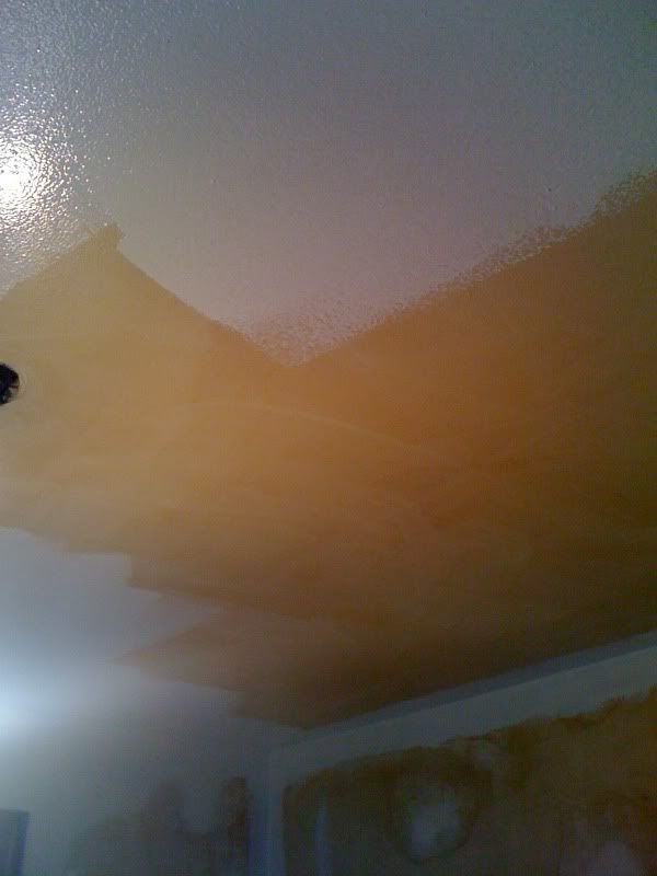
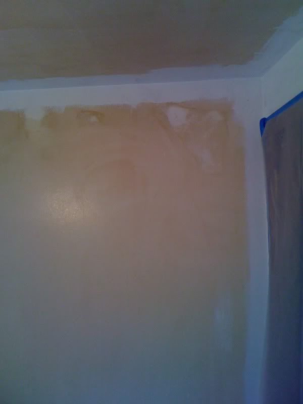
Here is a picture of the room when we just started to prime it.  Since the primer is super bright white, you get the idea of  exactly how nasty the cigarette smoke stains were.  Oh, and  we cleaned it some with soapy water before painting.

The ceiling:


(See?  I told you it was nasty!)


And the walls:


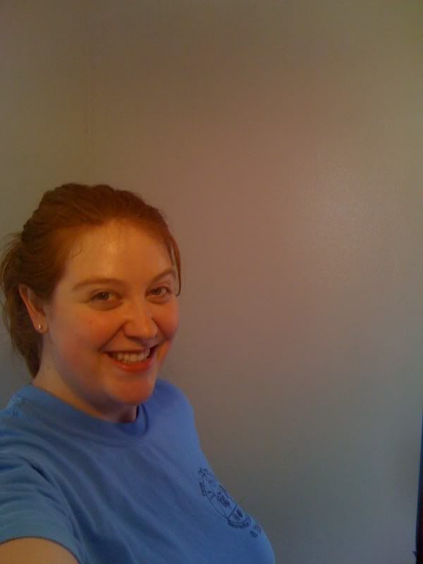
The happy face of progress:


Yes, I was a little to excited to have progress I could actually see.  And to see all of the bad stuff disappear.

Chris is happy to see the bad stuff go away, too!


We ended up going back and priming the trim. (That was not part of the original plan.)  Using this space for an office and possibly a craft room made us want to pick a more energizing and creative color for the room without going too nuts. We wanted something with a little more darker color than what we picked for the other bedrooms on the second floor, but not too dark because of the small size of the room.

We settled on Glidden's Antique Silver.  A nice grayish-blue that would be dark enough to be noticeable without being obnoxious.


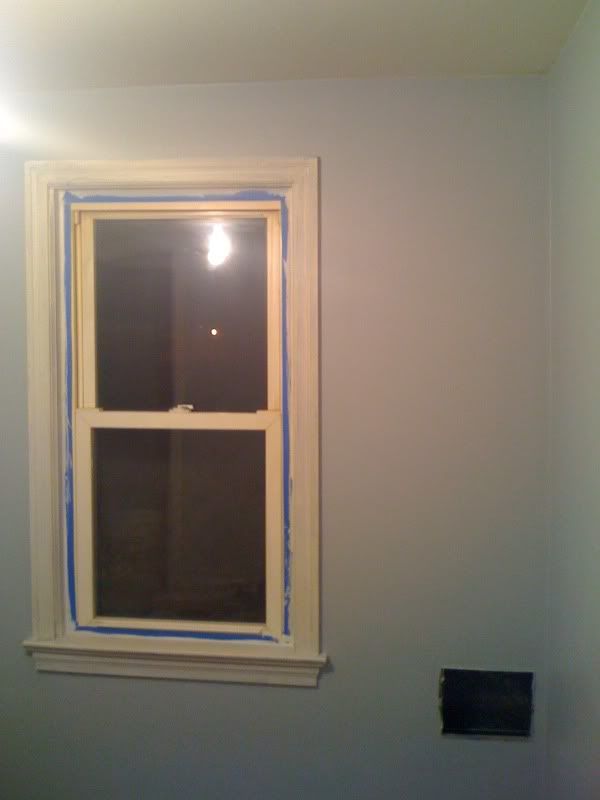
And here's the room after we put the color on the walls:


I guess my iPhone doesn't really take the best pictures, but for now, this will have to do.  The color is a little darker than it appears in the pictures.

I really like how it turned out!  I think the dark brown trim will look great and the dark stained office furniture we already have (thank you, The Price is Right!) will fit right in.  The floor will need to be sanded down and refinished in this room thanks to some very bad pet stains.  We'll be painting the trim this weekend and then we'll get started on the floors.  The work never ends!

November 17, 2009

Our Bedroom

We've been making some progress in the bedrooms and I'm most excited about our master bedroom! We primed the walls and ceiling last night and will begin painting them soon. We purchased two gallons of ceiling paint in Glidden's Parchment White, so we will be using this color throughout the upstairs ceilings (and possibly downstairs, as well)


For the wall paint, we decided on Glidden's Navajo Sand. I like this creamy beige color will bring out the lighter colors in our bedding. And, it's a relatively neutral color that will go well with other bedding sets when we decide to make a change later on.


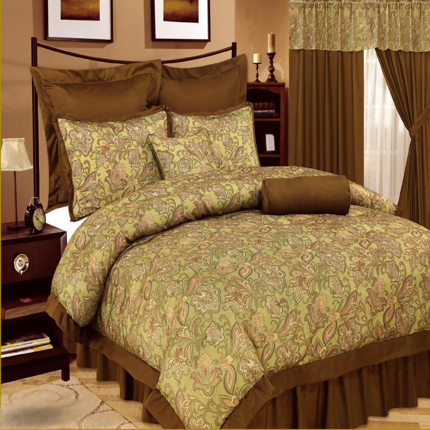
What bedding did we pick? Canyon Crest's Grand Paisley.


OK, so this picture doesn't really help much because it is a bit lighter in person.  The best part about this bedding set is that it is a complete room in a bag.  Not only do we get the comforter, sheets, pillowcases, shams, dust ruffle and decorative pillows, but we also get two valances and four curtain panels. I love how I don't have to find coordinating fabrics for the curtains or pillows.  I think this set will help make the master bedroom come together quickly and perfectly.  The entire 24-piece set was a bridal shower gift.

The room is on the small side (14x11) so we won't have much room for anything but our nightstands and our king-size bed. I'm OK with that.  I never really liked having a TV in the bedroom (not good for getting a decent rest) and our closet should be big enough to hold our clothes.  We may have room for a highboy, but I'm not counting on it.  The larger bed is much more important to us (and our sleep) than vanities and large dressers.

Trim and doors in the room will be painted Behr's Sweet Georgia Brown.


Third one down.

So, those are our color choices.  I can't wait to get the wall painted and see how it all looks together with the bedding and our light fixture!

LinkWithin

Related Posts with Thumbnails